
Some logos don’t necessarily need some sort of symbol or icon. Sometimes, just a little accent and a good font will do!

Step 1:
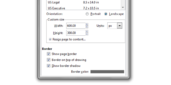
Once you have Inkscape open, let’s set up our document by clicking File > Document Properties. We’re going to set our width to 600px and our height to 300px. Also, be sure to check the box that says “Border on Top of Drawing” so we know where our canvas is at all times.
Step 2:
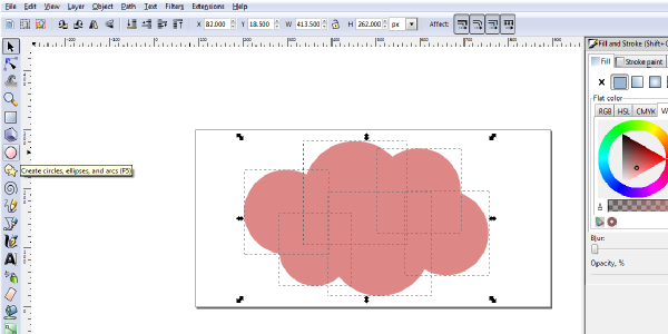
Now that we have our document set up, lets select the “Circle Tool” and just draw a series of overlapping circles like in the picture below. To draw perfect circles, hold “Ctrl” while drawing your circle. Also, make sure they’re all the same color and without strokes (if you don’t have your Fill and Stroke panel up yet, click Object > Fill and Stroke).
Step 3:
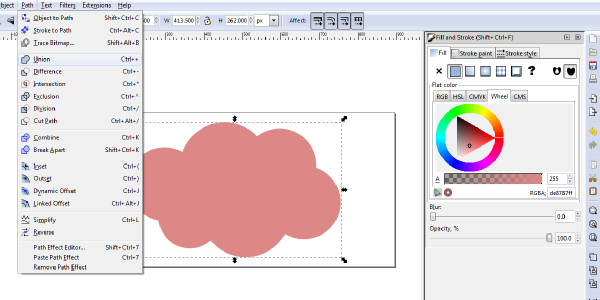
Select all of your circles with the black arrow selector tool. Then, click Path > Union. This will combine all of the selected shapes into one shape.
Step 4:
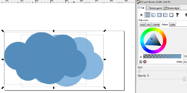
Now we’re going to copy and paste our new shape and give them some color (whatever you’d like, as long as they’re both different). To change the colors, click Object > Fill and Stroke. You can then select your shape and adjust the color to your liking.
Step 5:
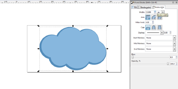
We need to add a stroke to our darker colored shape, because we’ll be placing it behind our lighter colored shape. To add a stroke, click the darker shape, then just click “Stroke Paint” in the “Fill and Stroke” panel. Make sure the stroke color is the same color as your fill. Make your stroke width something considerably thick, like 15px.
We need to place the darker colored shape behind our first shape. To do this, select the shape and click Object > Lower to Bottom. Then position accordingly.
Step 6:
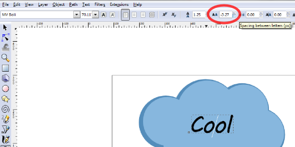
Now it’s time for some text! So select the “Text Tool” and click somewhere inside the shape to begin typing. I’m using the font MV Boli, but I’m also going to adjust the letter spacing. To do this, select your text and adjust the value of the letter spacing on the text toolbar (circled in red below). Squishing the letters together sometimes gives text a more modern look.
Step 7:
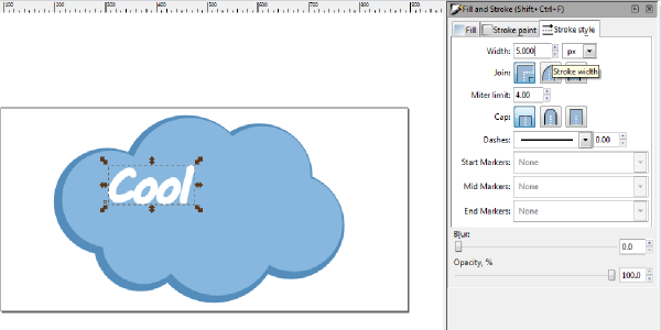
We’re also going to add a stroke to the text. First, choose a color for your text (I did white) and then add a stroke with the same color. I ended up making the stroke width about 3px.
Step 8:
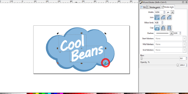
I wanted to add another piece of text, so select your text object, then copy and paste. This way, you keep the same formatting, spacing, and color. Afterwards, position them however you’d like. I rotated mine to give them a less strict feel, a more loose logo. To rotate, select your objects, then click on them a 2nd time to bring up the rotating nodes (circled in red below).
Step 9:
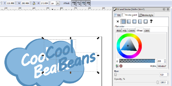
With both text objects selected, copy and paste those and drag them off to the side. We’re going to use these to create a backdrop of our text. So, color this new text the same darker color you used on the shapes (be sure to color the fill and the stroke).
Step 10:
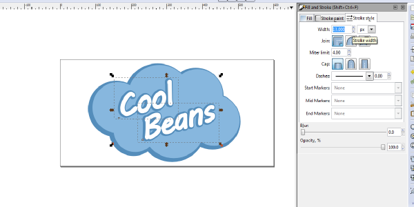
With our 2nd set of text selected, increase the stroke width to something nice and thick (I chose 13px). Keeping our backdrop text selected, we need to click Object > Lower so we can bring it below the other text, but keep it above our shapes. You may need to do this multiple times before it’s at the correct layer, so using the hot-key “Page Down” may be beneficial. Again, position accordingly.
Step 11:
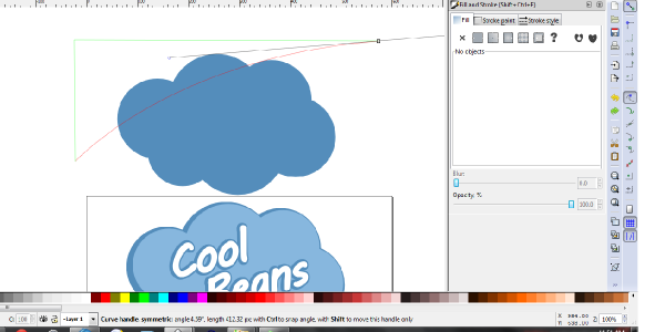
Alright, we have the base down! Now we’re just going to add a gradient shine to it. Start by selecting your darker colored shape, then copying and pasting it off to the side. Since this is the largest shape in our logo, we want to use this to create our gradient shine.
Step 12:
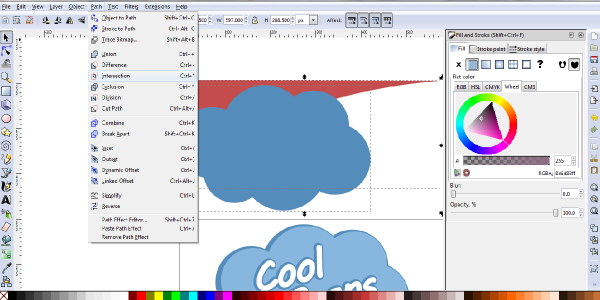
Once you have your shine-type shape finished, place your dark colored shape over it (Object > Raise or hot-key “Page Up”) and position it to where you would want the shine effect. Once in position, select both shapes and click Path > Intersection. This will give you an exact cut-out of the shape you’ll need.
Step 13:
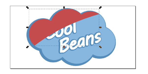
You’ll then want to take that shape and place it correctly over your initial logo.
Step 14:
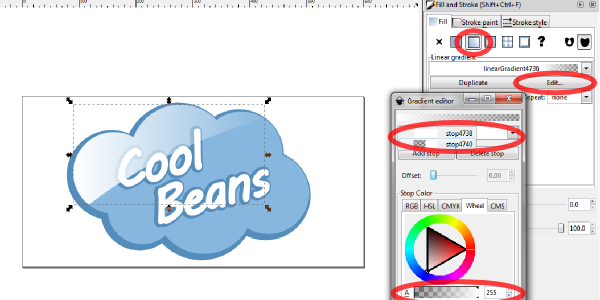
Now, we need to apply a gradient fill to our new shape. To do this, select the shape and go over to the Fill and Stroke panel. Under Fill, select “Linear Gradient“. This will bring up some gradient options, but you’re going to want to click “Edit” to bring up the Gradient Editor.
Step 15:
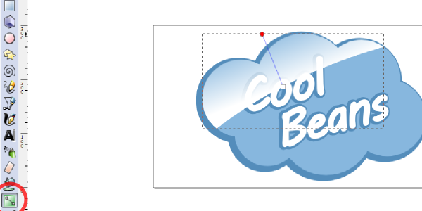
So now that we have our gradient colored, we’re going to click on the “Gradient Tool” so we can adjust the direction of the gradient. When you select your gradient, you’ll see 2 nodes pop up. You’ll be able to drag these around and position the angle of your gradient correctly.
Step 16:
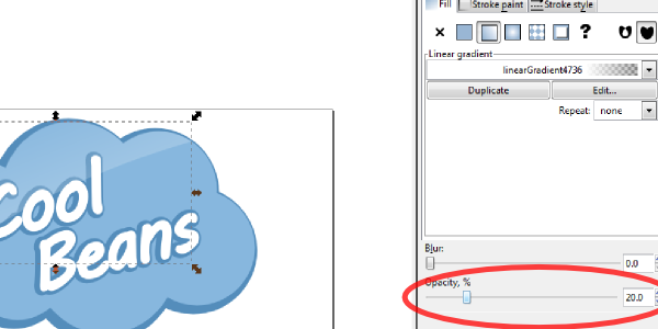
With the gradient shape still selected, head over to your Fill and Stroke panel and adjust the Opacity percentage lower (I did 20%). This makes it look a little more realistic.
Finished!
That finishes up this cool text logo! I hope you enjoyed this tutorial. For more tutorials like this one, head over to the Inkscape Tutorials page. Please feel free to ask any questions or anything, thanks.
Thanks for this tutorial. I’m just starting and it helps for the basics!