
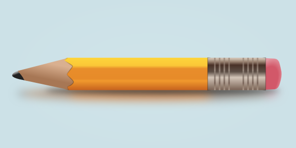
In this tutorial, we’ll be using advanced gradients and clever shading to create a realistic pencil drawing in Inkscape.
The Final Result
1. Drawing the Stem
Step 1
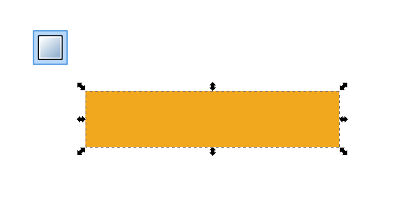
To start the stem, just grab the Rectangle tool and draw a rectangle. Mine was 41px tall, but yours can be different - just remember how tall it is for later!
Step 2
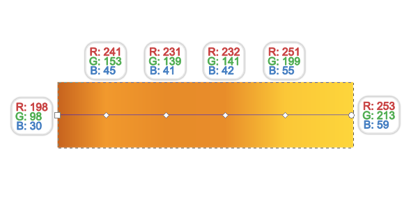
Now let’s apply a linear gradient and set 6 stops to the colors I have below. These colors were actually pulled from a real pencil for some extra authenticity.
Step 3
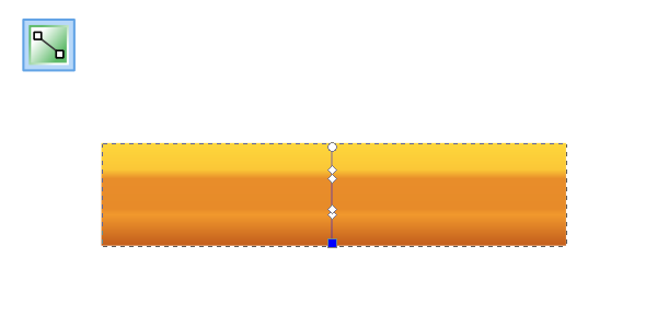
With those colors set, grab the Gradient tool and position it to how I have it below. You’ll see that the different colors act as the signature pencil shape.
2. Drawing the Tip
Step 1
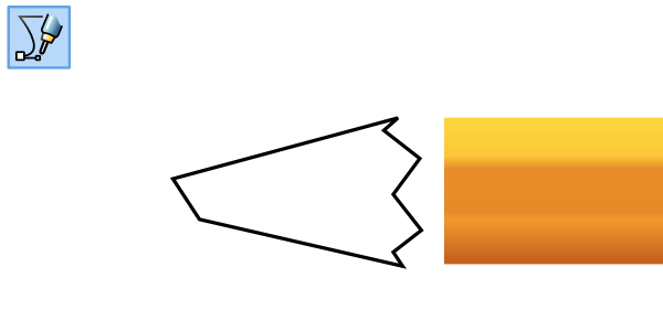
For the tip, let’s use the Pen tool and draw a shape like I have below.
Step 2
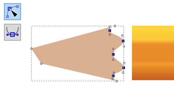
To smooth some of those jagged edges, use the Nodes tool to select those edges and select Nodes symmetric from the nodes toolbar. You can go ahead and fine tune those also.
Step 3
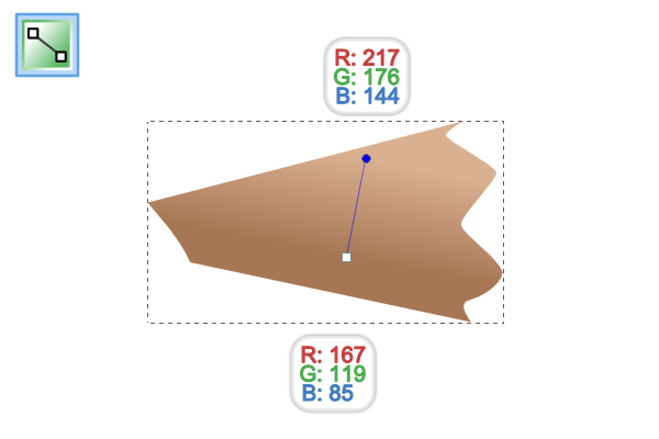
With my pencil tip shape all set, it’s time to apply a linear gradient. Of course, you can refer to the image below for the specifics.
Step 4
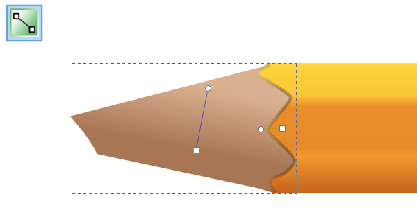
Now we can position the tip onto the end of the stem. I had to edit a couple of the nodes to make it look just right, so you may end up doing the same.
Remember when said to remember the height of your pencil? Well, now is a good time to make sure the tip is the same height as well.

Step 5
For some extra blending, let’s apply a linear gradient on the stroke. One stop will be black while the other one will simply be a transparent black. Position it like I have it below and you can see it adds a sort of shadow effect.
Step 6
Since we don’t want a sad pencil, let’s add the graphite tip. Using the Pen tool and free handing it worked well, along with rounding the very tip.
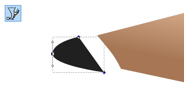
Step 7
Finally, we can position and color our graphite tip. I used a linear gradient with the colors shown below.
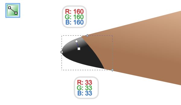
3. Drawing the End
Step 1
On the other end of the pencil, let’s draw another rectangle with the same height as our pencil (41px for me).
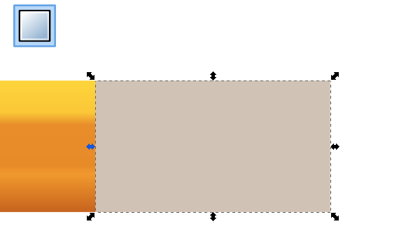
Step 2
Since this is supposed to be a piece of metal, we’re going to need a pretty good chrome gradient. Let’s apply a linear gradient with the 6 stops shown below.
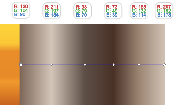
Step 3
With the Gradient tool, go ahead and put that crazy gradient into place.
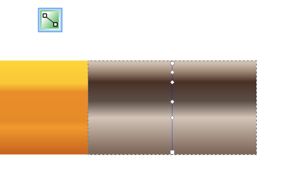
Step 4
Similar to what we did for the tip’s shading, let’s add a linear gradient to the stroke. This gradient will feature 4 stops with black, transparent black, transparent black, and black. We’re trying the get the fading black effect only on the left and right sides, so position it accordingly.
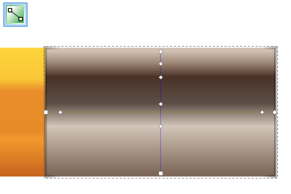
Step 5
To finish it up, let’s add 8 lines with a stroke of 2px each. Apply the same chrome gradient to these line’s strokes as well.
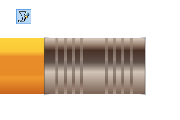
Step 6
With everything in place so far, this is what you should have so far. Looking good, right?
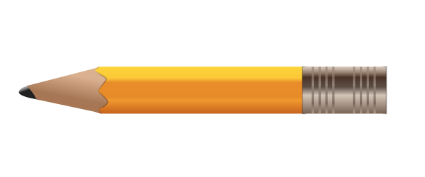
4. Drawing the Eraser
Step 1
To draw the eraser, let’s start with a rectangle with rounded corners.
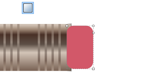
Step 2
Now we can go to Path > Object to Path to fine tune our eraser’s shape with the Nodes tool.
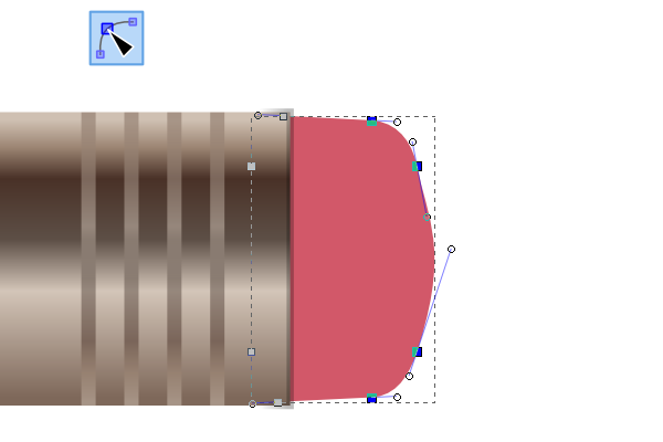
Step 3
Let’s apply a Radial gradient to the eraser and give it a couple pink stops.
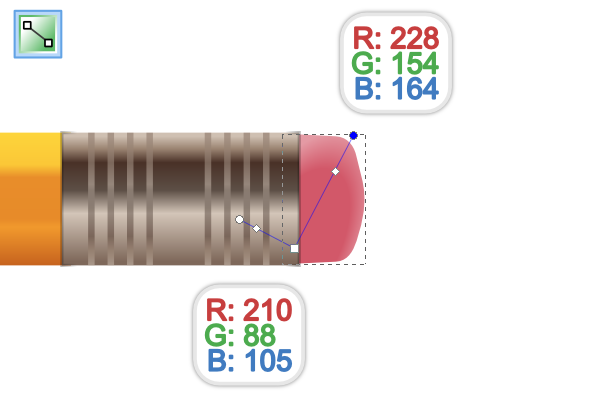
Step 4
With the eraser in position, we have a pencil! But, we’re not done yet.
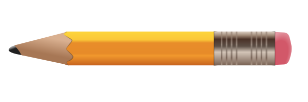
5. The Finishing Touches
Step 1
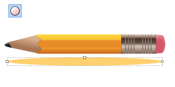
We’re going to draw a reflection, so let’s start with a wide ellipse just about as long as the entire pencil.
Step 2
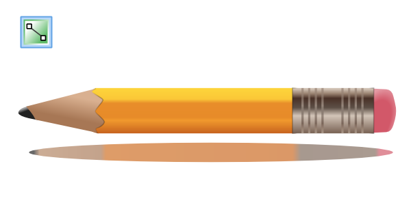
Now we need to apply a linear gradient with about 10 stops. The fun part about this one is that you can just go back and forth with the Color picker. The goal here is to color the ellipse to the same as the bottom of the pencil.
Step 3
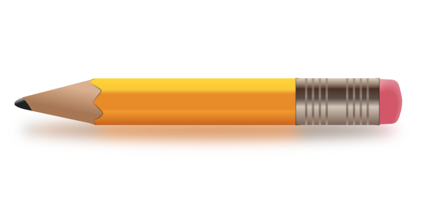
With the colors all set, let’s set the Blur to 7px and Opacity to 65%.
Step 4
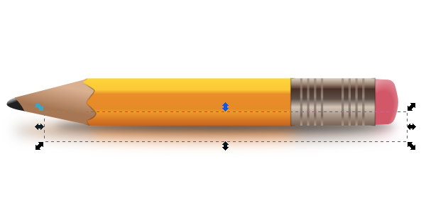
Just to finish it up, let’s do another ellipse the same way, but just color it black.
Step 5
All that’s left to do is apply some sort of background. Looks great!
And We’re Done!
Whew. That was a pretty hefty tutorial for the detailed, realistic pencil drawing. We learned a lot about advanced gradients and other shading techniques that will certainly remain helpful down the road. Hopefully you had some fun with this one. Thanks for reading!